When it comes to performance analysis, numbers are only as useful as the context around them. The real value often comes from understanding how different metrics relate to one another and what those relationships reveal about a team or player.
PFF Pro’s new Scatter Builder can make those comparisons easy. Users can pair two metrics from more than 90 team-level options or position-specific player menus, with the results automatically plotted against league averages. It serves as an easy way to connect the dots and show how numbers relate to one another.
Here are 10 combinations worth exploring — five for teams and five for players — and what each tells us about the 2025 season.
Points per drive vs. points per drive allowed
Build it yourself: open this chart in the Scatter BuilderScoring per drive runs across, and points allowed per drive runs up. And because the builder flips “allowed” metrics automatically, the good corner is always the top right.
Seattle had that corner to itself, scoring 2.24 points per drive and allowing 1.31. The Rams scored more than anybody at 2.47 and still came out second-best on the difference between the two.
EPA per pass play vs. EPA per run play
Build it yourself: open this chart in the Scatter BuilderThis is the identity chart, and the quadrant lines do the sorting: complete offenses top-right, one-dimensional passing teams bottom-right, run-first teams top-left, broken ones bottom-left. Ten teams beat the league average in both phases.
Green Bay led the league throwing the ball at +0.24 EPA per pass play and was a below-average running team at -0.04 — exactly the split a single offensive ranking hides. Buffalo (+0.20 and +0.05) and the Rams (+0.23 and +0.03) were the only offenses above +0.20 through the air that also stayed positive on the ground.
Success rate vs. explosive play rate
Build it yourself: open this chart in the Scatter BuilderEfficient offenses can be explosive offenses, too. The “we just grind out first downs” identity mostly isn’t real, which makes the teams that sit away from the line more interesting.
San Francisco is the genuine exception. Its 48.0% success rate ranked third in football despite an explosive-play rate of just 12.5%, the widest gap between the two on the chart. Pittsburgh (45.1% and 12.4%), Kansas City (45.1% and 12.7%) and Cincinnati (45.4% and 12.7%) are in the same quadrant.
Pressure rate against vs. sack rate against
Build it yourself: open this chart in the Scatter BuilderBoth metrics here are ones where less is better, and the builder inverts both axes so the top right remains the good corner. Pittsburgh’s pass protection was in a class of its own, allowing a 25.6% pressure rate, 4.5 percentage points better than second-place Miami and more than 10 points better than the 36.3% league average. Cleveland was at the opposite end, allowing pressure on 45.0% of its dropbacks.
Man coverage rate vs. EPA per pass play allowed
Build it yourself: open this chart in the Scatter BuilderCleveland played the most man coverage in football at 52.1% and ranked second in EPA allowed per pass play at -0.12. The Jets weren’t far behind in man-coverage rate at 45.0% but had the worst pass defense in the league at +0.29 EPA per pass play. Houston ranked 19th in man-coverage rate at 30.5% and led the league at -0.16 EPA per pass play, while Detroit played the second-most man coverage at 48.8% and finished right around league average at +0.03.
Big-time throws vs. turnover-worthy plays
Build it yourself: open this chart in the Scatter BuilderThis is the signature PFF plot, with the turnover-worthy-play axis flipped so the top right represents maximum reward with minimum risk. A 20% snap minimum opens the pool to 43 quarterbacks.
Matthew Stafford’s season barely fits on the graph. He recorded 58 big-time throws, 21 more than any other quarterback, along with 26 turnover-worthy plays. Joe Burrow is the real outlier, though, with 18 big-time throws and just two turnover-worthy plays.
Time to throw vs. pressure-to-sack rate
Build it yourself: open this chart in the Scatter BuilderShedeur Sanders held onto the ball longer than any quarterback in the league at 3.32 seconds but went down on only 17.6% of his pressures, better than the 18.3% league average. Brock Purdy (3.23 seconds and 9.0%) and Caleb Williams (3.24 and 9.6%) had the two lowest pressure-to-sack rates in football despite also ranking near the top of the league in time to throw.
ADOT vs. YAC per reception
Build it yourself: open this chart in the Scatter Builder
This is one of the cleanest “archetype maps” the builder produces. The bottom right is a pure field-stretcher, the top left is a manufactured-touch receiver, the top right does both and the bottom left is a problem. At a 20% snap cutoff, that puts 140 receivers on one chart, so the middle is crowded — but the edges are where the interesting names are.
Tyquan Thornton is the outer limit on depth, with an average depth of target of 27.8 yards, 7.8 yards deeper than second-place Alec Pierce at 20.0. KaVontae Turpin led all wide receivers with 8.2 yards after the catch per reception, with Rashee Rice (4.9 and 8.1) close behind.
Yards after contact per attempt vs. explosive runs
Build it yourself: open this chart in the Scatter BuilderJames Cook is the story of the chart. He led the league with 45 explosive runs despite averaging a perfectly ordinary 3.0 yards after contact per attempt, and Kenneth Walker III (3.1 and 42) is right behind him. Neither back’s long runs are coming primarily from breaking tackles — that’s burst and blocking, and putting the two metrics side by side is the fastest way to see it.
The genuine both-ways group sits in the top right. De'Von Achane (4.1 and 40) and Bijan Robinson (4.0 and 36) were the only backs in the league at or above 4.0 yards after contact per attempt, and both recorded at least 36 explosive runs. Derrick Henry (3.6 and 36) and Jonathan Taylor (3.5 and 36) are right alongside them.
TE Target share vs. receiving grade
Build it yourself: open this chart in the Scatter BuilderTight end usage broadly tracks tight end quality on this chart, which makes the misses more interesting. The league average is an 8.5% target share and a 63.4 PFF receiving grade.
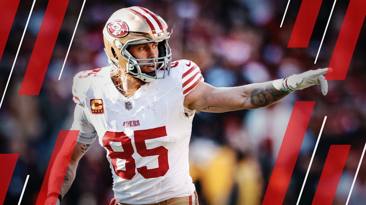
George Kittle is the biggest standout, with a 91.0 PFF receiving grade, the best among tight ends, despite an 11.9% target share. Darren Waller (7.8% and 87.6) and Dalton Kincaid (10.9% and 86.1) are in a similar spot. All three are only on this chart because the filter is set to 20%, as none of them played half of their team’s snaps.
Introducing the Scatter Builder
The Scatter Builder is available in Premium Stats Pro — the upgraded Premium Stats experience now available with a PFF Pro subscription.
It has four primary controls: NFL or NCAA, Team or Player, season (2019 through the current year) and a week range.
Team mode: Choose from more than 90 metrics across seven offensive and defensive categories, with a search function to quickly find individual metrics. Charts can display team logos, team colors or PFF grade colors, and the results can be filtered by conference.
Player mode: Quarterbacks, wide receivers, running backs and tight ends each have 15 to 19 available metrics, including PFF grades. Player headshots are also available as chart markers.
Both modes: Users can swap axes, invert either axis and download or share the finished chart. Metrics where a lower number is better — points allowed, pressure rate against, turnover-worthy plays — are inverted automatically, so the good corner of every chart is the top right.